
A few technical details. The two main experiments here were shading and cropping. I've done shading before, and it it's still primative. I think it worked reasonably well on the jacket Sue is wearing. Not as well on her tights. The shadow on her nose is decent. (This, of course, doesn't actually look LIKE her, and my character doesn't look like me. That's not the point.) I started using two tones of shadowing, but then just got tired of the effort and fell back on using one. I had also accidentally scanned the images in as grayscale rather than B&W, which picked up a lot of noise in the cross-hatching, which blocked some of the color from coming through. I fixed it in some places, didn't bother in others (like my hat in the 2nd panel).
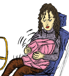
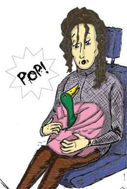
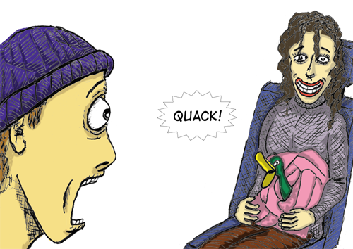
Also, since I'm critiquing things, the expressions in panels 4 and 5 aren't conveying exactly what I want. In 4, it's supposed to be mild surprise. "ooooo" (the vowel sound in the word "two"). You can't really tell the lips are coming out for that. The smile in panel 5 is supposed to express a sort of embarrassed, uncomfortable, self-conscious moment (think: Charlie Brown from Peanuts). If there was dialgue, she'd be saying, nervously, "Oooops--heh, heh." But it looks sort of like a happy smile. I think my expression in the 6th panel generally works and fits the dialog (and the excess balloon size is intentional), but then I could use myself as a model for me (yes, I do try to model expressions for other characters, but the only other one that worked was the duck...don't ask). So I think the expressions are passable, but could be improved, however I'll need more practice. Oh, and I am fond of the typeface/font used when the ducky pops out, even though it was not particularly gory since it was just wrapped in a jacket.
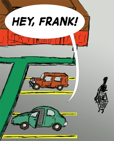
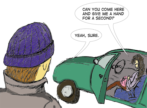
The backgrounds are mostly not present. I was trying to decide how much effort to put in to those things. I don't want to waste time and effort or worse, distract from the main action. On the other hand, they are a bit plain. In the first panel, I wanted a parking lot full of cars, but that quickly became obvious that it would take much longer than I wanted to spend on it, and wouldn't add to the picture. I think I'm getting better at wrangling the speech balloons and their tails.
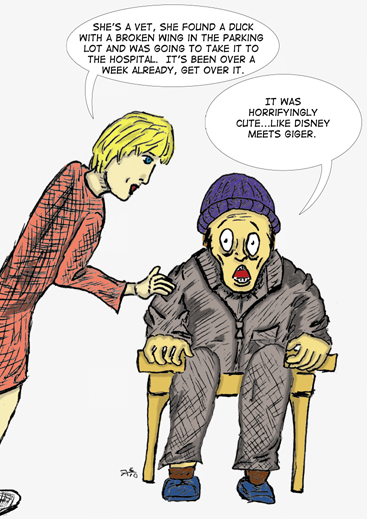
Finally, the cropping. I was pretty aggressive this time at cropping the images to try to keep the focus on the important stuff, even at the cost of some of the things I had drawn along the edges that either didn't serve any purpose or were only half rendered. An example of the cropping is the woman at the end: I had drawn her leg connecting to the foot, the rest of her dress, etc., but it didn't add anything and looked pretty bad to be honest (because I think I knew it wasn't important). An example of something I was thinking of cropping but wasn't able was the space to the left of the parked cars. In theory, there should be the same yellow lines, but I hadn't bothered to put them in (pencil, ink, or color) but in the end couldn't crop that part out (and didn't care because it was minor).
Because of the agressive cropping, the pictures are of varying sizes and there's not a lot of dead space for me to resize it. So each one is different. I didn't want to spend time resizing the images or trying to match things. The only place where it really stands out is in frame 4 and 5 since they are deliberately on the same line (I had to do some HTML magic to make sure they'd be that way) because the reaction shot is essential to the pacing). Again, a lot of this is pretty incidental.
Like I said, too much information about what was going on for a simple duck-popping-out-of-someone's-gut joke. Enjoy.
Back to Frank's
cartoon page.