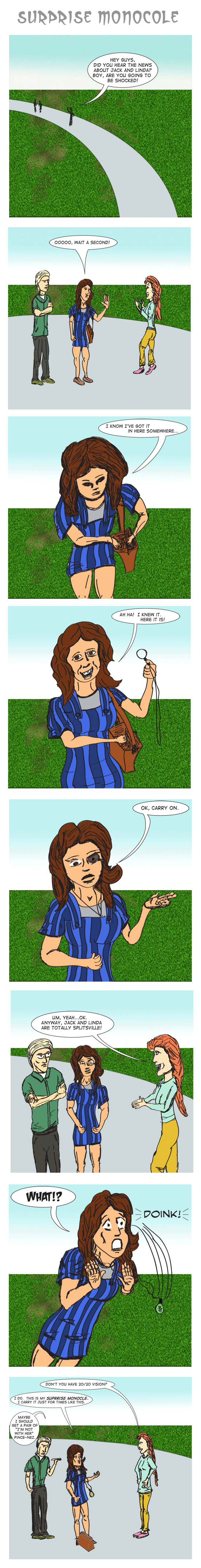
Normally, I would cast the generic "me" character, but this time it had to be Alice, at least in personality. My drawing bears little resemblance to her, nor was I really trying. She WAS wearing stripped overalls when she made the comment, but that's about it. The other two characters fill the roles of "the straight man" (who is also a woman) and "the other guy" who is there because it felt better that the straight man was talking to more than one person. The other guy simply has an added comment at the end that implies "this happens all the time." Both of those characters are really "no one in particular."
Another thing that came up in the category of "archaic yet expressive eyewear" was the logical follow-on of taking out a pair of pince-nez, putting them on, frowning, leaning forward, and muttering, "mmmMMMM????" quizzically. But that would complicate the joke, so I never drew that. At the end, I decided to work that into the other guy's line at the end. Also, I learned that pince-nez are pronounced in no way resembling how they are spelled (thanks, French!).
The 7th frame is what everything was based around, and the expression is what I wanted. I drew the frames in order. The 5th frame, when she's wearing the monocle is probably the closest to what I was trying to achive. I wanted a "heart-shaped" face wtih "voluminous hair" (Dar Williams once had to take a break while peforming a concert I attended because she was having "a voluminous hair moment") that wasn't that long. The straight man's hair is meant to be long, by contrast.
Anyway, I'm also OK with the foreshortening of the body and face in the 3rd frame. For the body, I used my little wooden figure as a model when I did the inital sketch. Teh face doesn't have details, but it's OK, but not great. The left arm is weird, and the hands suck, but I'm still flogging myself about faces.
And then there's the 4th frame. The shape of the face is wrong the eyes don't really match, and it basically isn't right. Plus the lines of the face don't fit. However, I wanted the character to be happy and smiling because she found what she was looking for. That was the essential element of that frame. And that trumped everything else. Plus I didn't want to keep trying to redraw it again and again. So that one was a disappointment.
And then there's the second frame, when she's got a long, pudgy face. I drew the faces in order, and this was the first time we saw her so I was still figuring things out. I'll also mention the straight man's head in that frame is way too big, completely out of proportion.
Frame 6 is OK, not great, but OK. Again, the straight man's head is way too big compared with the size of her torso. Maybe she's just a freak that way. Also, it's clear I didn't really care about her. I forgot the cuffs on her long sleeve shirt and didn't care about how her shirt and pants came together. Deduct a couple points from that frame.
And then the last frame. What the hell??? Somehow she turned into a cross between Julianne Moore and Jay Leno. I can't use the excuse that this was early in the process, since I had already don't all the rest. Just laziness. Disappointing.
A few differences this time was that I only had 1 file containing all of the frames. I used groups in Photoshop to keep all of the inks, foreground and background, text, and assorted layers together. This let me keep all of the images the same size. Another difference was the final compositing of the reduced images (500x500 pixels) into one long image. I decided to try that out. It's a 600K image, but that's no worse than 8 images that are about over 100K. I lined the images up by hand, so the boarders might not be the same around each frame.
I also generated the speech balloons last (in Illustrator) and pasted them in (to Photoshop) after coloring the images. I had to place and resize the images, which looks OK, but it means they might not all be the same size. I'm not sure how much of a problem that is. There were a few balloon tails that were a little more complicated than what I normally do and they seemed to work OK.
I also didn't do any shading. Basically, I wanted to get this finished and online, since it's been two weeks since I had the idea, and I'm busy the rest of the week, and I couldn't do shading while traveling without the Wacom without it being really, really tedious. Perhaps shading is a crutch or maybe it takes it to the next level of quality. In any case, I'm still not doing it for this one. So yes, another thing to chalk up to laziness.
I wanted a simple background, so I decided the characters would meet on a path outside by some grass. I looked for some grass samples I could use as a fill pattern or a brush and then came across a tutorial to generate your own grass patterns. It was very straightforward, though had 30-50 steps in it. It's not great, but again, for what I wanted, it was OK and at that point grass is pretty noisy (though there are too many black pixels). I tried to play with having the dirt "show through" in a couple places, decided it looked like ass and skipped 10 steps of the tutorial relating to that, but left the couple muddy patches in. It doesn't hurt things since it establishes some recognizalbe areas in the background. I used an image mask to clip the background. The mask isn't perfect, as is visible by the white to the left of the Alice's head in frame 2. I fixed it in many of the other frames, but was lazy. I left the path as neutral gray, since I was feeling to lazy to invent a similar pattern for it. The sky was a simple gradient that just provides something rather than a single flat color.
The inside of the monocle itself had an adjustment layer on it to alter the hue, saturation, and lightness of whatever was behind it. It's a small thing, but I'm learning about adjustment layers.
The original images were 2000x2000 pixels. No matter how hard I try, the inked lines rarely connect, so the magic wand tool isn't sufficient to select an area to color. I wind up using the lasso. With a Wacom pen, it's not a big deal. Using a track-point mouse, it's a much bitter hassle. And trying to fill in an area using the mouse as a brush is a real drag. That's why I didn't want to add shading, though it'd be easy and look nice.
I already commented on the purse thrown in at the end for the last frame. The lines aren't great there, but it's fine. In frame 6, the straight man has no inked lines indicating the end of her shirt by her wrists. In frame 8, I added them by hand at the end, since at that distance, a simple quick black line looks OK.
The fonts are from Blambot, as usual. Digitstrip for most of the text, and I forget what the title, "What!?" and "DOINK!" fonts were but I'm pretty happy with them.
So, all in all, this seems reasonable given the 1-shot joke.