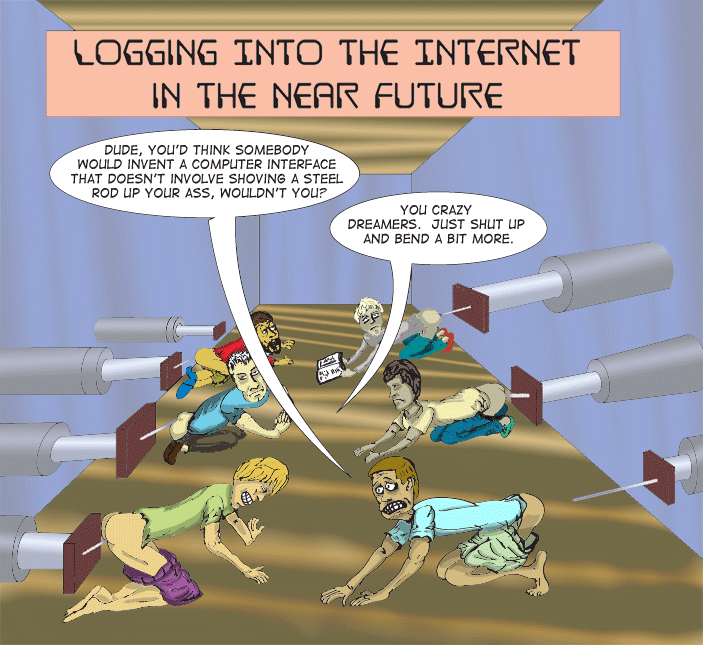
Workstation of The Future

Workstation of The Future

> user interfaces [as a field] has turned to shit...it's more by fiat
> now, put something out there, crush the resistance, and eventually
> people will get used to taking it up the ass and ask for it by name.
He replied:
Sounds like a cartoon of someone logging in to the internet in the near
future.  "Dude, you'd think somebody would invent a computer interface
that doesn't involve shoving a steel rod up your ass, wouldn't you?"
"You crazy dreamers.  Just shut up and bend a bit more."
The gauntlet had been thrown down. I was, more or less, challenged to draw that cartoon.
My follow-on comment was:
I might have to take pictures of some people making faces or use a mirror.And finally his reply:
The problem is their facial expressions should be totally normal,
because computers fucking us up the ass is totally normal.  People don't
really care as long as people can get the minimum they need.  (Which by
the way is one of only two possible things, both of which are called
"pussy". ("That cat was the best fuck I ever head." --Steve Martin))
I obviously stole the text verbatim. And I kept all but the two foreground
characters with neutral, blasé facial expressions, with one reading
a book. I decided the speaking characters should have some facial expression
to make things more interesting: the one on the right having a look of
dread, as he is about to get the pole up the ass, and the one on the left
who is chastising him for complaining will be showing discomfort. Perhaps
once the pole is in, then you just go about your business, but the
process of getting it in is not much fun.
I was thinking of having some keyboard or screen or fancy computer-like devices around as well. But first, I wanted to keep things somewhat simple, and second, I'm lazy and this already took me much longer than I originally planned. I was going to have some flashing light above each pole-inserter or maybe a sign that said "online" or something but then I decided I didn't really need that. I wanted a big, heavy-duty, hydraulic, heavy-machinery type look to the devices. So, thus was born the WTF (Workstation of The Future).
In terms of drawing, I wanted to have a line of people with some perspective. Plus, I can't really draw a straight line. I drew a really rough sketch in photoshop. Then I added some basic features to the figures on a second layer on top of the first.
I realized that I wanted to have some sort of perspective, so I used Illustrator and it's 1-point perspective to try to create the devices in a way that sort of had some semi-proper perspective to it. At that point I realized that drawing 6 figures would be more than enough for me and I didn't want to deal with an infinitely receding line of figures with poles up their collective asses, and all the hydraulic devices receding to the vanishing point as well. So I decided I'd cheat and put walls around things so that could cut off some space. Also, I knew the speech balloons and the title would take up space. So that was enough for me.
Thus, I finished the inked version. I brought that back into photoshop and colored it.
To make things a little more interesting, I played with the gradient fill to put some shading variations on the walls and floor. I colored the devices and the figures and put some shading on the devices using the gradient fill and just by hand with everything else. I'm still learning that. I also semi-screwed up and had the lines behind the colors (they weren't all transparent) and I hadn't removed some of the lines that were going to be hidden, like the obscured parts of the slabs on which the poles were mounted or the backside of the ring where the plungers connected. So that took a bit more effort than it should have to fix that.
So all in all, it took about 2 weeks to do this. Should have gone quicker, but I was also working on finishing my taxes, reviewing a few papers, and other stuff.
All this for a quick joke about the next indignity with computers
and the Internet involving ramming a pole up your ass. Still, I think
it works.