
Some comments...
Here is this full-size 3x2 version of this, if you prefer that and have a big screen.
The idea
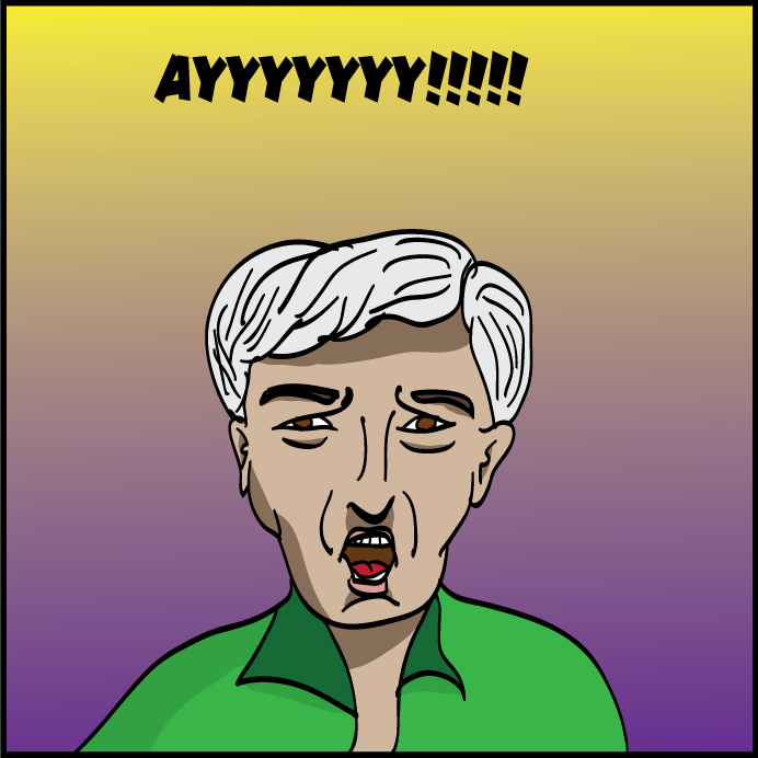
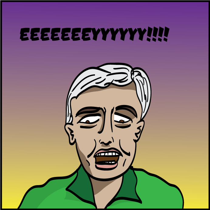
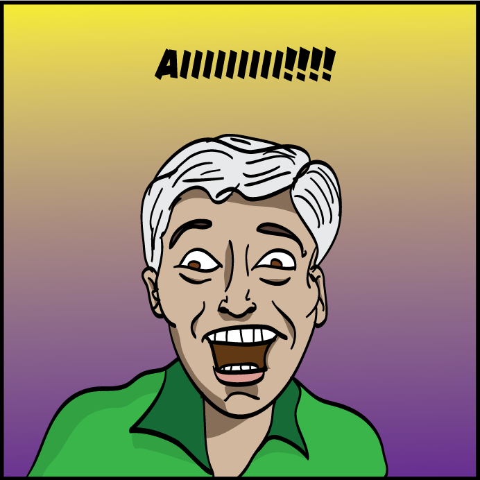
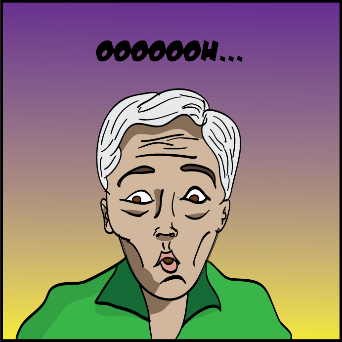
I was talking to Katie during a pickup ultimate game and came up with this joke. I believe I made the pun first, and then went through the letters, and the appropriateness of matching the sounds and actions amused me. I said, "I'm going to have to remember this one," so I could reuse it elsewhere.
The original title was Vowel Movement but then I realized that'd spoil the whole joke, so I changed it. Consonant Shift is a thing describing the changes in the pronunciation of some words (the consonents) that led to related words that superficially sound different in other languages. I also like A Sequence of Vowels which more literally describes the first four panels without giving away the joke.
Creating it
I did a very simple sketch blocking out the general frames. A day or so later I looked for some reference images for the facial expressions I wanted but couldn't find anything that close to what I wanted. So the next time I was at trivia, I asked two team members to say a long-A or long-E with exaggerated expressions, and one was said it but with a minimal expression, and the other literally had no change of expression on his face, let alone over exaggerated, which is what I was looking for.
I was thinking of setting up my camera on a tripod to take pictures of me. Then I remembered my laptop has a camera and took a few pictures of myself. I used them as references for the drawings focusing mostly on the mouth, eyes, and eyebrows. The mouth was difficult for me on the U (I decided it was a short-u "oo" sound or moure like eyouuuu (gross!) kind of thing) and the perspective and foreshortening looked terrible on the my last drawing. So for those two, I used the actual images as starting point (tracing some of the features). So it has better proportions but looks different from the others. The first looks the most different from the other 5. But I'm OK with that.
I drew it all in Illustrator, using the brush tool to "ink" the drawings. Then made a copy of those and converted to work in Live Paint mode. I colored them. Then I created another copy (layer) and used the pencil tool to draw lines and merge them into the Live Paint objects. I tried to use the knife tool, but it just didn't work. I've had problems like that in Illustrator a few times.
The speech balloons were pretty easy, though I had to figure out the placement. I never drew the bottom of the 'main character' since that wasn't important. And most of him was already out of frame or blocked by speech balloons. At the end, I didn't feel like drawing a few bits of him that might be visible beyond the speech balloon.
For shading, I just selected darker colors. But the blonde character's shirt was an Illustrator swatch pattern, because it looked off-beat. But I wasn't sure how I'd make a darker version. Talking to a friend over dinner in Portland, OR (most of this was done quickly, then there was a 1 week gap while I was at a conference), he suggested using a semi-transparent polygon with a dary gray background to shade things. So that's what I did. Not sure if it work perfectly, but in a pinch it's OK. The underlighting of the "main character" in the background looks mostly OK. The blonde character's head shading is the most subtle and not that great.
Then I realized the background was boring. I wasn't sure what to draw so instead I just went for something easy but that's a little more visually interesting than white or another plain color. I swapped the progression with each panel just to make things less monotonous.
I used a bunch of layers groups in Illustrator, then generated a .png file, then pulled that into Photoshop to cut it into smaller single-panel pieces (plus the title), and upload it.
The characters
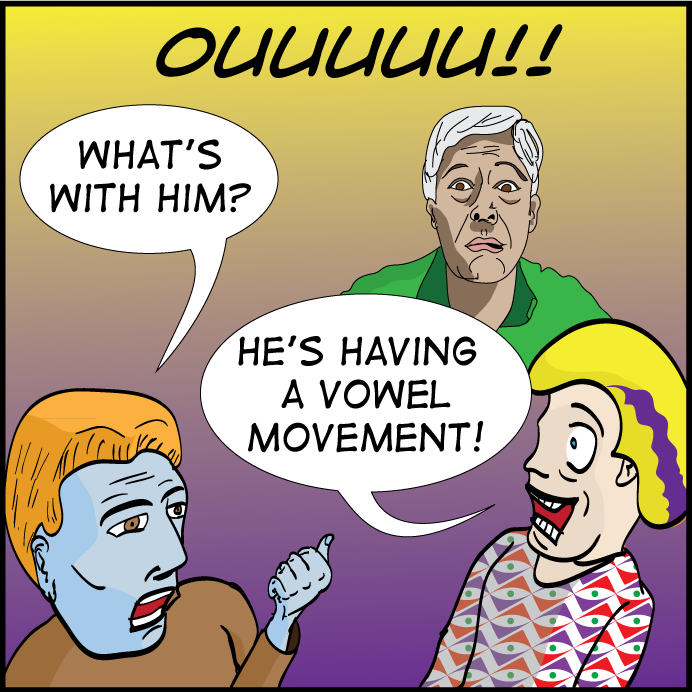
The entire strip is just a one-punchline idea. And that idea is poop! And that's funny enough in itself. And yes, I do believe he has just shit himself.
So first we have the main character. And he changes his looks during his "vowel movement" but that's more because I'm bad at drawing the same character doing different things. It was not intended to be me, and doesn't really look like me, but some of the facial structures in the last two panels were taken from me.
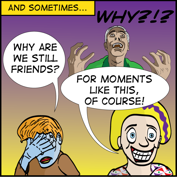
I had to introduce a character to say the punchline, but that meant I needed another character to provide the set-up. They're kind of separate from the main gag, so they look very different from the main character. The first character is the one with the setup line. In a way it's sort of serving as a me-ish character, but not really. Why does he have blue skin? Because the straight-line and punch-line characters are essentially Muppets in my mind, making a silly joke while totally being in on the fact that they're making a silly joke. The punch-line character is, in some sense, also me because I'm the one who made the joke to Katie originally. But it's also a Katie-ish character in that she'd be just as happy to say that punch-line. Of course, it doesn't look at all like Katie other than the fact that she has blonde hair and some purple in it, which was visually cool to include. Why then does she not have Muppet-orange skin? Because I colored her first and didn't think of that till I got to the other character.
The dialog on the last panel felt like the needed post-punch-line banter of Muppets (or something I would say). The two-tone backgrounds weren't intended to be a reference to the punch-line character. It was just vivid and different colors I had recently used. Though if this was all some doing (or do-do-ing, heh heh) by the punch-line character, it'd be appropriate that she'd leave her mark on the world in some way.
Back to Frank's
cartoon page.