Intermission

Click here for full size picture.
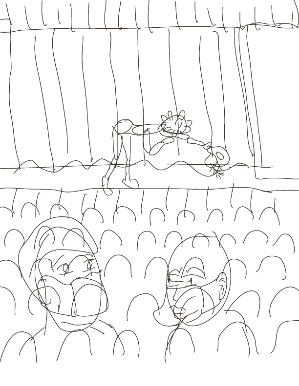
One picture, too many words (so very skippable)
This was originally going to be a "quick sketch" but then it got a bit more involved, though it's still pretty simple.
The Context
After a month of a pretty low incidence of COVID-19 cases locally, they jumped up in the last week and a half, following the national trend, even though our numbers aren't as bad as elsewhere. So, quite simply, it now felt like instead of us seeing a light at the end of the pandemic tunnel, it was more a mere brief break. An intermission to the shit/horror show. And that intermission was rapidly drawing to a close.
I decided having a player on the stage calling the audience back to their seats seemed the appropriate metaphor.
The Making Of the Drawing
Everything is pretty straightforward with the drawing. But there
were a number of technical bits I did to create and compose it.
I created a "making of" animated GIF that shows, more or less, how
the final image was made, component by component. Below is the GIF
and after that I'll explain the main parts of each stage. It's
pretty boring.
The Stages
Rough Sketch
The first step was drawing a very rough idea of what I wanted. I was blocking out where the elements would be and would fit where. I didn't need straight lines. I did use the miniature posable wooden figure to get a sense of what the bow should look like. You can sort of see the segments. Actually, the very first thing I did was scribble a few of the elements on paper, but it was even rougher than the first drawing. I also sketched how the KN-95 mask looked (on me).
Stage/Curtain Lines
Since the stage was so essential, I wanted it to look somewhat plausible. I looked at some (cartoon-ish) reference images online and used the Illustrator pen tool so I could make straight lines and curves. I also decided that I wanted curtains and that most of the stage would not be visible. Since it was intermission, the curtains would be closed, and it's easier to make.
Actor Sketch (blue)
I used the Illustrator brush took to draw the basics of the "actor" freehand, kind of trying to follow my rough drawing but also trying to improve upon it. I looked up renaissance costumes and saw something that had a Shakespeare doll Christmas ornament, with the balloon-y pants and the green color with yellow highlights. I decided that was easy enough to draw and sets the right feel of old (olde?) theater (theatre?). I also looked up a renaissance hat. I wanted something simple but more like a ruffled beret with a feather. The blue image deviates from the sort-of top hat in the rough sketch.
And of course since this is supposed to be the SARS-Coronavirus-2 incarnate, I needed to give him the spike protein suction cups around his mostly round head. Really, he is the most important element of the entire picture. The rest is just context. He is the central part of the top half of the picture.
People Sketch (blue)
The people were there because there had to be someone he was addressing. And I wanted to have someone reacting to what the Actor was saying. The initial sketch was two people in the foreground, kind of at a 45 degree angle, like they were turning to face the Actor as he makes his announcement. And there'd be some kind of "uh oh!" reaction going on in their face. I never put much thought into giving them any dialog since there was nothing they could say that wouldn't be redundant.
I figured for variety, one would be a man, the other a woman. And since this is in a pandemic-era setting, they'd both be masked. They didn't need to be anyone in particular, so they aren't. They're not supposed to be me or people I know. Mostly. In the rough drawing the left one is wearing a generic sort-of mask. The right one's facial features are visible in the rough sketch. I drew both with mouths so I could have things positioned properly, even though they were going to be covered up.
I wanted to draw a real mask and realized I didn't really know how it looked and fit. So I got out my KN-95 and fired up Zoom and put it on my other monitor, so I had to turn my head 45 degrees to see the screen, which was the pose I was looking for. So the mask actually looks pretty decent. I wanted to do something different for the other one. Something that was less boring. Aaaaand that's when things took a minor detour in a slightly weird direction.
I wasn't really thinking about the Renaissance/17th Century Plague Doctors (though I guess that wasn't too far off from Shakespeare's time). My KN-95 mask always makes me think of a parakeet beak (and I've been know to say, or chirp, typically to myself, "cheep-cheep" when I put it on). So I was already in the mindset of bird mouths. And I wanted to do something different. I don't know why but it felt like a duck bill as a mask was the right choice. Again, I looked up some reference images for cartoon ducks (more like logos, not like Disney or Warner Brother ones) and saw one I liked and used that as inspiration. And I liked it. It made me laugh. It has nothing to do with the mood, the tone, or the context of the picture, but a duck mask felt so perfectly out of place that I felt I had to use it. And so I did.
It still amuses me.
Seats
Next up were the seats. They were easy and simple, since they were really just background. I made an upside-down "U" shape in Illustrator, copied it a bunch of times to make a row, and them made 4 rows. Done.
Later in the process, I wound up scaling them up to make the seats a bit bigger so the silhouettes would be more visible. That change isn't shown in the GIF and the seats are in the final, bigger size.
Rough Sketch Removed
Getting rid of the rough sketch let me get a decent idea of what it was supposed to look like. I had an idea of size and scale of things.
Inked Stage Actor
The next step was "inking" the different components. These were typically done with the pen tool, but sometimes with the brush took to give it more texture. So first up was the Actor. Most of it was done with thin lines since he was going to be far away.
Moved Actor
As I was looking at the placement of the Actor on the center of the stage, I realized there would not be enough room for his dialog. I had the text and font already made which is not shown in the GIF. I decided to move him to the left leaving the top right to be free for the speech balloon. I wanted the font to be big so it could be readable, as the loopy sort of font can be hard to read. Because there was space on the stage, moving him was trivial—just a matter of hitting the arrow keys a few times.
Removed Original
Technically, I moved the original and didn't keep a copy. I recreated a copy in the original position for this GIF. So removing it as its own step was here just for the clarity of the making-of animation.
Inked People in the Foreground
Next up was inking the foreground characters. It was pretty straightforward. Did I mention the duck bill makes me laugh? I was cackling a lot once I got the curves in the bill to represent what I wanted. Oh, and I threw on a polo shirt so I have a reference for something approximating a collar. Beyond that it looks nothing like me.
A step that wasn't shown was that right after inking the 3 characters, I duplicated their layers and used Live Paint mode on them and colored them white, so the background wouldn't show through them. Live Paint removes the styles from all the lines, so the original layers, which were in front of the duplicates, still had all the brush strokes of different thicknesses.
Removed Blue Actor and People Sketches
Hiding the sketches (in blue) then let me see the cleaned up, inked version of things. And as I mentioned above, while they were black and white, they were not actually transparent, so I could get a better idea of what would and wouldn't be obscured. They are transparent in the GIF image.
I was tempted to stop there and just put it in my Sketchbook of the Day page, but I wanted to do more since I knew I could make it look better.
Colored in Actor
The next step was to add color to things. The Actor was first. I duplicated the layer with him and used Live Paint. I used basic colors. Any shadowing was actually done later, but since I was changing the colors of the Live Paint objects, I didn't keep the ones with the more uniform colors. There's a drop shadow that's also visible that was added late in the process when I was adding shading and highlights.
Colored in People
Then came the two people in the foreground. While I do have at least two, maybe 3 friends that have varying levels of purple in their hair, and can be mischievous, it was mostly an easy way to just make things more visually interesting. Again, the shadowing/shading was done later. I added an invisible line to the Live Paint object which let me section off the drawing so I could use a less bright (using the HSB color model) variant of the color for shadows. Also, the skin tones are a purple/pink because they're mostly props (muppets of a sort), reacting to the announcement.
At that point they were looking decent. Later, I realized that while their eyes and eyebrows show concern, it's not as easy to read that that was the emotion I was going for. If their mouths' would have been visible, I would have made them in an "oh!" expression which makes it easier. It is harder to convey expressions through masks when you can't see much of the person's face. I admit that the duck-bill doesn't exactly lend gravitas to the scene, but I don't care. It's still funny!
Colored in Stage
The stage itself was a simple Illustrator built-in wood gradient color. It was good enough, and then some. The curtain was a different gradient and seemed to look good enough as well. I added some of the brigher and darker colors of red to the curtains, leaving a lot of it empty.
Colored in Seats
The seats were also pretty easy. Just two different colors for the first two rows, and then a color gradient that faded from a dark red to black after that. I had to look up how to do color gradients on Live Paint objects, but there were good resources out there.
Added Red to Curtains
The next part was more laziness. I made a big rectangle and filled it in with a RED! color. I let anything that wasn't filled in on the stage use that color. Done. And then I made the front of the stage be a brown by putting a brown box midway in the RED! box. Done.
Added Drop Shadow on Curtains
It's a totally minor thing, but I watched a video on how to use the Illustrator Blend function to create complex drop shadows. It was pretty neat. I created two copies of the shape of the bottom part of the overhead curtain and had a blend going from black 70% opacity to like 25% opacity. It cast a simple shadow. I was going to do it for other parts, but didn't feel like doing that. It was at that time that I added the simple drop shadow to the Actor. I also added the shadows on the underside of his costume and the to parts of the faces of the other people.
Added Speech Balloon
Really, I think I the speach balloon done at an earlier time. I went back and forth a lot with different colors to make the text readable. I tried using a black outline on the font but that would up taking up too much space, so the yellow was barely visible. I liked the font as it felt like it conveyed the humble tone of the Actor which belies his completely horrible nature, as he is COVID-incarnate and his mission is to sicken, fuck-up, or kill as many people as he can. In the end, I decided to keep the font and text simple.
Added Audience Silhouettes and Called It Complete
I showed a version of this it to a friend and initially he was unsure of which way the seats were facing since I didn't want to spend much time or effort on them. So I added some silhouettes of a few people in the audience who were already back in their seats. I found another sort-of cartoon-y theater image that had silhouettes that I used as a reference. (Note: when I say I use something as a reference, I'm copying it, but only by looking at it and drawing freehand. It's what I base a component on, but it's me doing it.)
I think it looks OK and it serves the purposes of giving a cue as to which way people are facing. And they do sort of look like people—I was happy about that. There is a problem with proportions in that they are smaller than the Actor even though they are closer to us than he is. I choose to ignore this as I don't want them any bigger and certainly not bigger than him, because they are background.
And that about wraps this one up.
Started on Saturday July 31, 2020.
Completed Sunday August 8, 2021.
Back to Frank's
cartoon page.