MTV Undead
Too many comments, too many words
(skippable)
The idea
There was a question at trivia a few weeks ago on MTV Unplugged. For some reason the phrase MTV Undead came to mind. It amused me and I jotted it down so I'd remember it later. I was thinking it would involve some iconic, dead rock stars. I didn't know exactly what I wanted to do, but I wanted to do it.
Line drawings and traces
I dug up a few reference images I liked and then set about blatantly ripping them off in Illustrator. Essentially, I traced over the key parts of the image by hand. I didn't want t use Illustrator's auto trace function, both so it would be more genuinely something I made, but also so I'd have a sense of drawing the actual textures, lines, folds, and perspective.
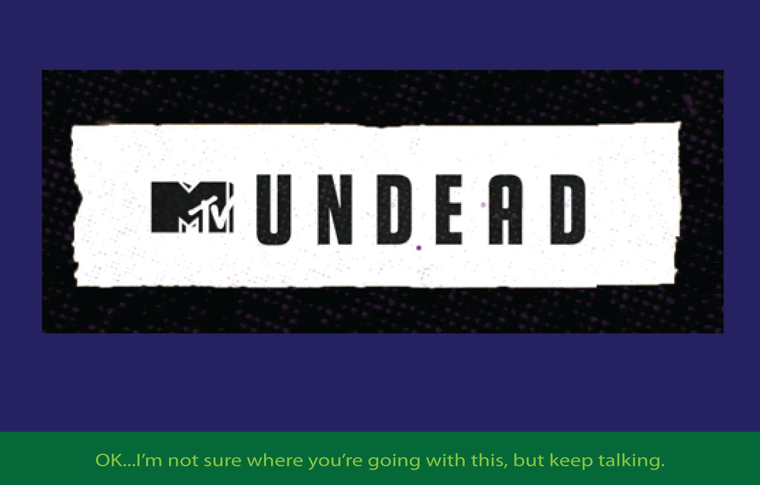
Actually, I skipped a step. I first pulled up an MTV Unplugged logo and adapted it for my purposes. Note that there is no letter A in MTV Unplugged, so I took the letter P and did some playing around with it.
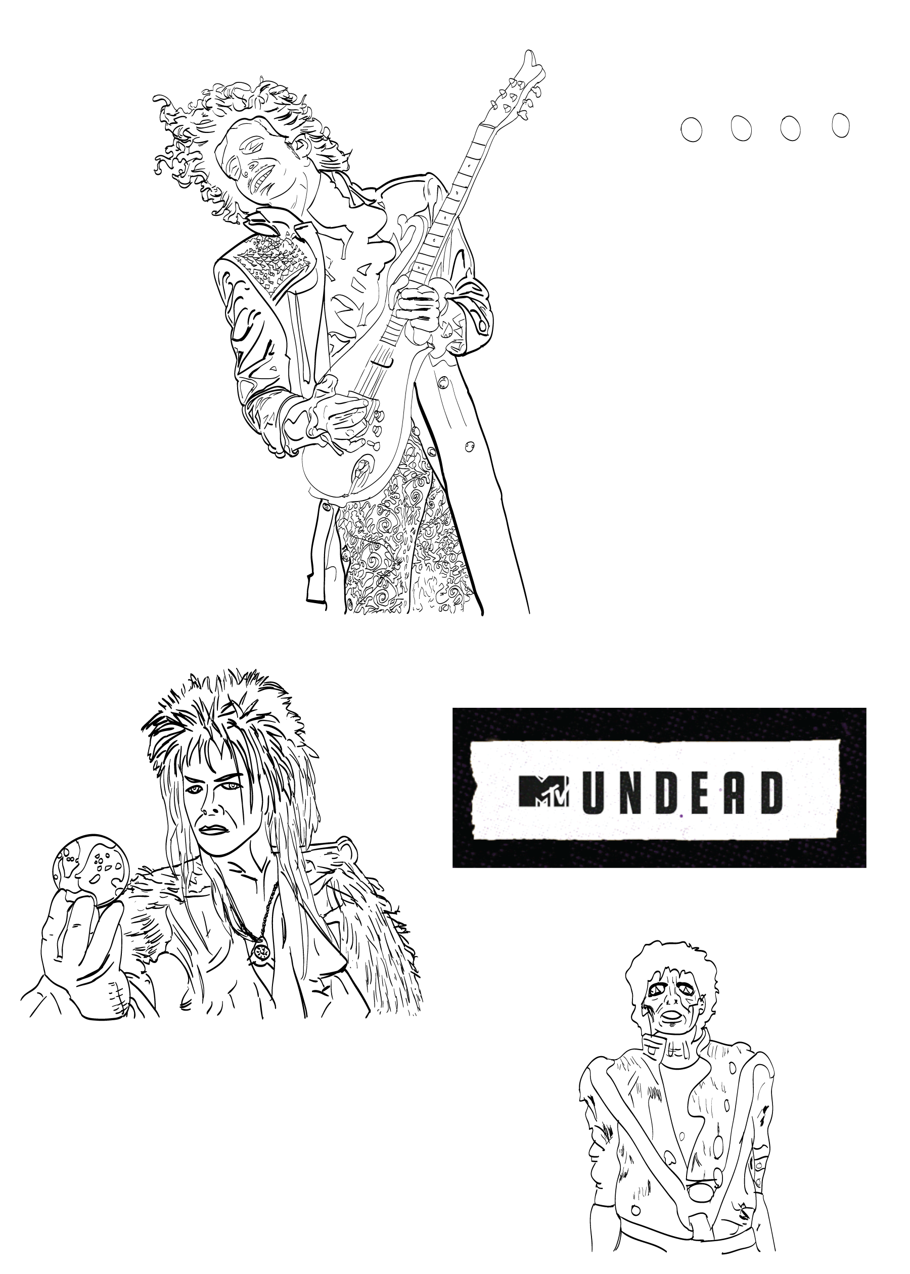
Initial line drawing of logo and 3 figures
(click for full size version.
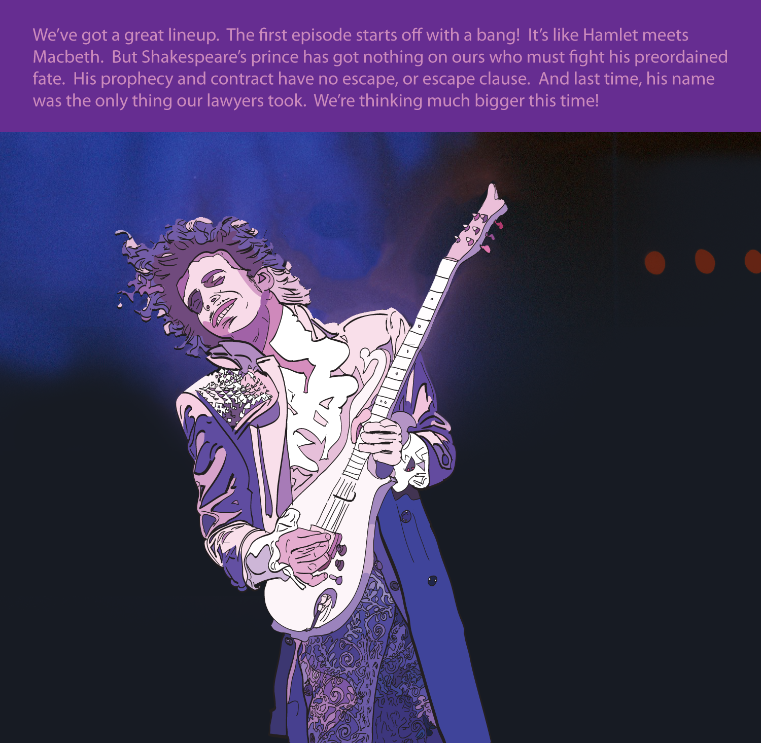
I picked Jareth the Goblin King because it's visually interesting. I could have done Ziggy Stardust, but I liked this better. The zombie was the obvious one. Then the one jamming with the guitar seemed appropriate. However, holy shit but the paisley pattern on the pants was a pain in the ass that took a long time to do. On the other hand, it looked decent. I must admit he could be confused for Hendricks in that picture. But I figured the strong purple colors in the next version would make it clear.
The logo seemed decent and I was pretty happy at how the line drawings turned out. Next up was to play around with coloring the images.
Coloring the figures
Even though this was putting the cart before the horse, I wanted to see how the figures would look in color. I started working on them from bottom up, doing the easier ones first.
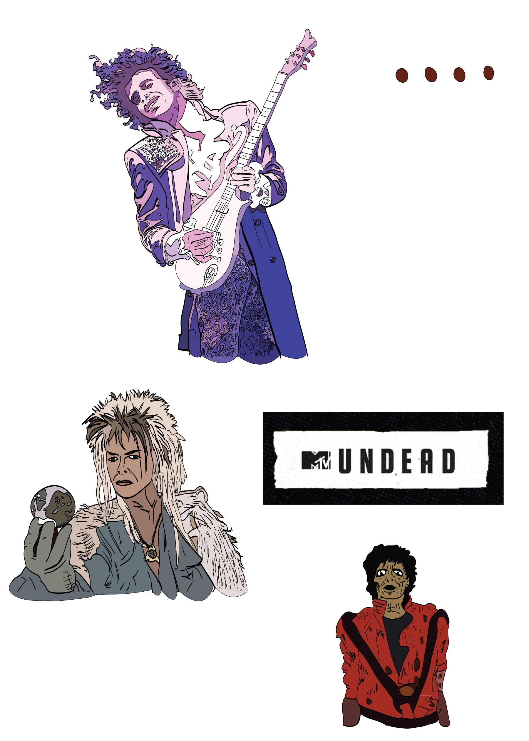
Line drawing with colors
(click for full size version.
I wasn't sure if I was going to stick with Illustrator and the Live Paint mode or try something fancier. The zombie had mostly 2 colors, red and black so I figured that'd be easy to test things out. It didn't take long and looked "good enough." I didn't do much in the way of shading or improving the image. But it's so iconic that it remains very recognizable.
The Goblin King was next. There weren't many colors, but there were different highlights in his hair, especially the light patch on top, and the crystal sphere had some interesting swirly patterns reflected in it. And the coat he wore had a pattern similar to his hair.
Though not doing anything that complicated, I started to use the brush and pen tools to draw out regions (like his hair) where there'd be different colors. A lot of it was separated by the lines of the hair. I had taken the original image, copied it, and then turned it into a Live Paint layer. I lost the brush stroke textures on the Live Paint layer, but I had the original version to overlay it, so I could still have some of the varying line thicknesses from my original drawing. Sometimes I would adjust the lines on the Live Paint layer and sometimes I would add new invisible lines (no stroke color) and then Merge them into the Live Paint Object.
The Purple Paisley painting was the last one...and a pain. But I like how it came out. All this time I was basically cheating sampling the colors on the original image. Often it didn't look right on the palette but was fine in the image, especially next to the other colors of similar shades. I was quite happy with the results of the paisley on the pants. The shading and shadowing looked decent. In the original picture, he's practically glowing in the darkness. The hands were sort of if-fy, but they convey the essentials. For the spiky, sparkly grid-work shoulder piece, I decided to go with a more impressionistic approach rather than try to make it exact. I can't fucking draw a straight line without a ruler, so I liked taking the "honest" approach with this one. The guitar neck, frets, and strings look hand-drawn, which is fine. The shading on the hair used no-color lines to separate the blocks.
I liked what I had, but I didn't know what I was going to do with the images. So next up, I needed to figure out "the joke" that would this all together. I knew it would be MTV Undead but what would that mean? I also knew I'd need to have some backgrounds for the images, but again, I'd need the context first.
The connecting idea
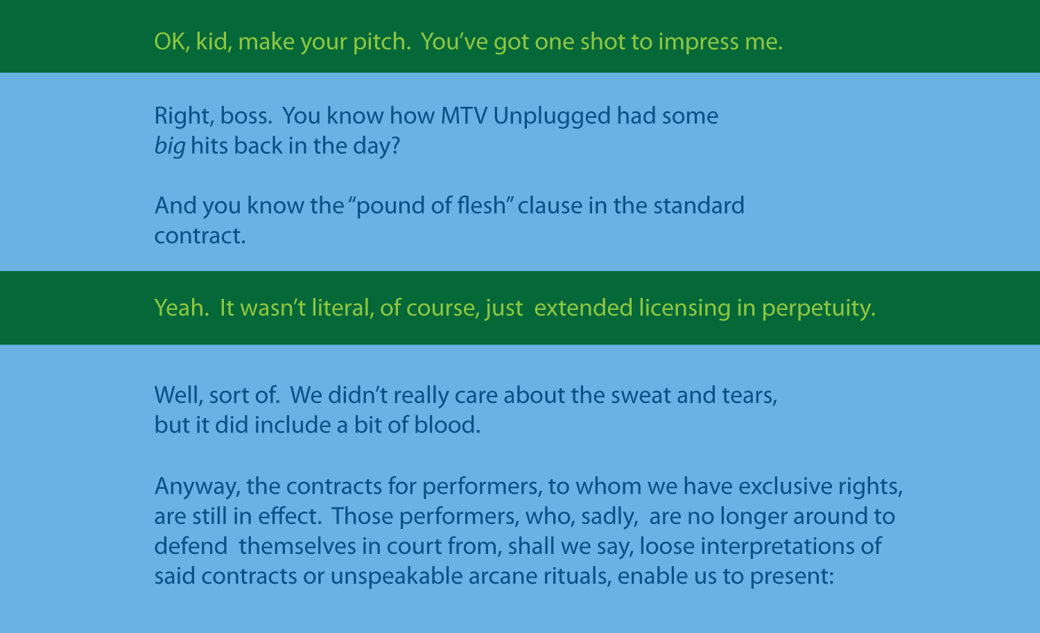
The next step was to come up with the idea or the story. I figured it would either be an ad for the show or maybe someone pitching it. That way they could give the glitzy sales version, but could also go into some of the darker details.
For this part, I simply jotted down some text for the panels and figured out what would be there. Initially I was thinking the purple picture would be last, but really, the zombie picture needed to be last. So the best image is first and the worst is last. I'd prefer to have things improve, but maybe selling it early on works. The alternative of doing a better job or redoing the other images was not an option I was considering. I typed the initial version of the text into different "art boards" in Illustrator as starting points.
One more character
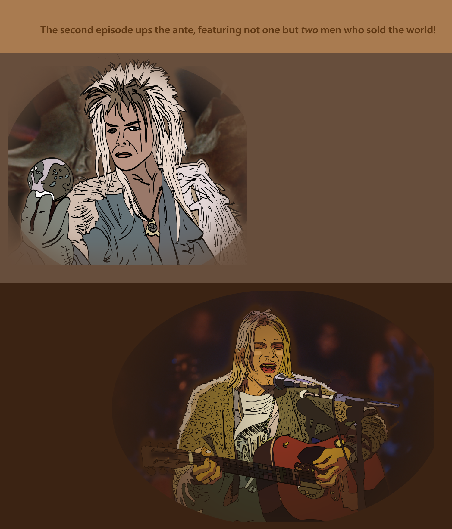
However, it became clear that I was missing one of the most iconic MTV Unplugged performances. One which was part of the original trivia question. I knew I was going to have to add another image. I don't have any work-in-progress versions of that, but it was similar to the others. Also, it was fitting that he sung a song that the Jareth guy originally wrote and performed (obviously this has nothing to do with the movie Labyrinth). I figured the two of them would need to be featured together, even though they never met.
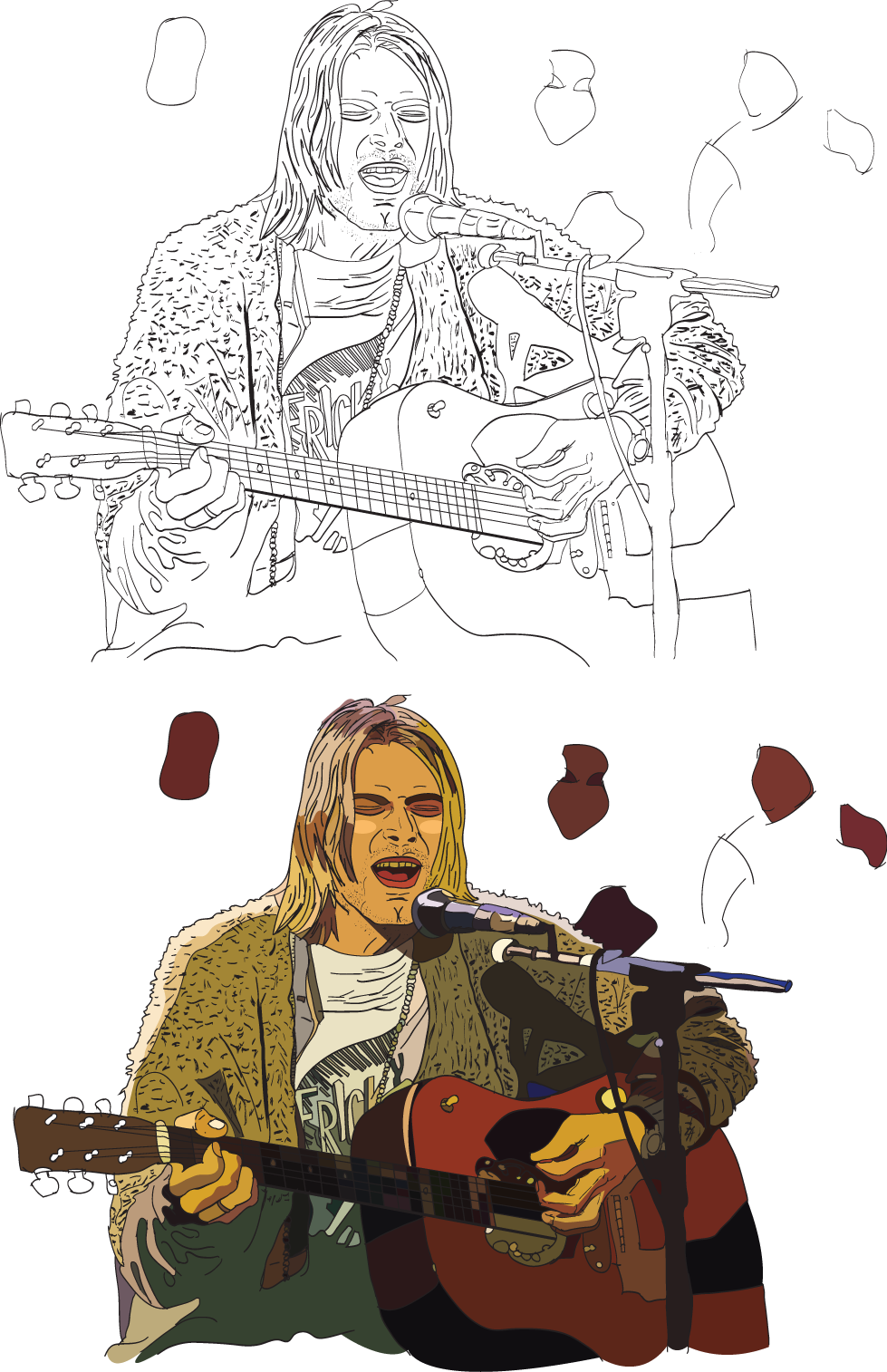
Line and color drawing of 4th character
(click for full size version.
OK, I decided to add a line and color drawing of the last character since I think it looks cool.
I also decided that the musicians I wanted to use didn't need to have been on MTV Unplugged as long as they had appeared on MTV and maybe in some concert. So no Morrison, Janice, Hendricks, or really any of the "classic rock" era of the '70s would be eligible.
At this point I should mention that back in November of 1994, I had already drawn a bad joke involving MTV Unplugged with the same character. I used no reference images, just my imagination and colored pencils. I knew he had long straight hair and that was about it. I assumed he wore a plaid shirt, since that was the Grunge style at the time (note that as I type this I am wearing a plaid shirt, so I've got nothing against them).
Turns out I was completely wrong, as he wore a t-shirt and a sweater (which was recently auctioned for some ridiculous amount of money). The sweater had an interesting texture on it that the flat coloring of Live Paint would lose. So I used pen strokes to suggest the texture. I also used a lot of shading on this as well. The skin colorings of everyone look weird, but the colored spotlights do weird things. I was happy with the way this one came out too.
The backgrounds
The easiest one was the logo. I figured that was going to be, in essence, a title card, so I wouldn't really have to do much for that.
I decided the dialog at the beginning was really introductory material, so nothing really would be needed. Having a tall building or anything would just be confusing. Also, it was easier to just say I didn't need anything.
So the first real background was Panel 3. I decided I wanted something similar to the original, where he's playing on a dark stage with a blue haze of smoke catching a little of the light that was illuminating him. I couldn't do the gradations in Illustrator, so I decided I'd deal with all of that when generating the final images in Photoshop.
I tried a few different things, using gradients and hand drawings and more, and couldn't really get the look I wanted, since there's a ton of very subtle colors (and noise) there. Eventually I gave up and decided I'd use the real background, more or less. I had generated the three lights, but I took the background with the figure cut out of it. I had to do some alterations, blending, filling, and and a bunch of masking so I could put my drawing in and have it fit. I like it, even if it is cheating.
The next was the two for Panel 4. I had put in two different colored brown backgrounds but decided once again to use the backgrounds from the original pictures. The problem is that there background wasn't wide enough to fill the space. So after a bit of playing around, I decided to fade the background a bit using a transparency gradient and call it a day. The Jareth background is just visually interesting but doesn't matter. The Unplugged one is nice in that it suggests people in the background, audience or other band members. The two tones of brown kind of go along with the theme that they're related as "the two men who sold the world." I really didn't put much thought into the meaning of it. I'm sure it could be interpreted in many, many ways.
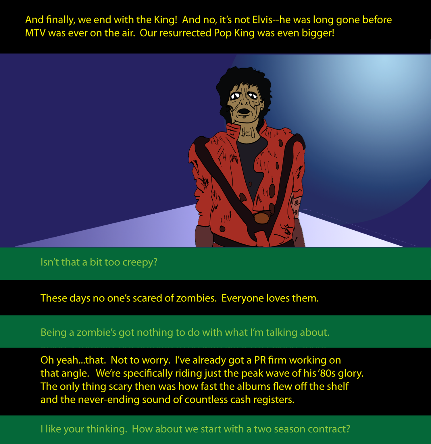
Since I wasn't going to update the last picture or add much shading, I deciding I'd generate some aspects of it myself. The original picture has him leading a horde of zombies, but I didn't want them in there. People should be drawn, so I wasn't going to cheat on that and I wasn't going to draw them, because it's all about the main characters. There was a bright light in the upper right corner of the original, so I created a spherical gradient using that color and a darker color from the far side of the image. I also created a ground surface using the perspective of the original picture. There were buildings in the background, but I didn't want to add that, because again, without the other zombies, it wouldn't be right.
Also, this would be the main punchline. There'd be more dialog here, so really the most important thing is just the character and then the words. This is most certainly rationalization, but I'm OK with that.
The dialog
The last thing was to figure out how to integrate the text into the strip. I did not want to draw some cartoony looking characters who would be talking. And using speech balloons seemed like it would not fit the impressionistic/realistic style going on.
I figured text at the bottom or top, like a comic book, could work. So that was the approach I went with. We never see the speakers, but the dialog makes it clear who they are, and that it's a pitch for a new show. I decided to use a fairly normal, "serious" font rather than something that would be in comic book dialog. I didn't want to use a narration font from a specific genre (like science fiction, horror, mystery, superhero, etc.).
The first text I worked on was Panel 3. It was clear that the pink and purple color themes needed to be reflected in the text. And since this was part of the pitch, it was at the top. I wanted text that would be readable yet fitting.
After that, I worked on Panel 1. Since I wasn't going to use balloons, I decided the two "voices" would have different colors, rather than different fonts. Also, that let me put line breaks into some of the speech, so it could have a bit more feel of flow (and pauses). I figured blue was neutral so I used that for the "main" speaker. I needed a different color for the other one and decided that since he was the "businessman" who controlled the money for the project, his speech would be green. I also decided that the main speakers color scheme would vary with the panel as appropriate. But the money-guy would always be green. That decision made it easy to format Panel 2.
Since I was using browns as background colors in Panel 4, I used that as the template for the one line of dialog. Originally, I considered using some other words, like a quote from Labyrinth like, "So, the Labyrinth is a piece of cake, is it? Well, let's see how you deal with this little slice..." or the iconic squeal of feedback on the Unplugged concert. But it didn't feel like those would enhance anything.
And finally, for the last frame, I figured a sinister black background with yellow lettering would be somewhat spooky. And then I reused the green dialog.
Final thoughts
Overall, while this has a similar approach humor-wise, the look of this is different, since really, a lot of it is just copied from other things. I also recently learned about specifying width in percent with no length in HTML to make images auto-scale. That coupled with a max-width seems to make things scale appropriately for big and small windows. Also, for no particular reason, I have not included the actual names of the musicians that appear here. I can't quite say it's out of "respect" as this doesn't really feel all that respectful of a joke, though I do think they all were incredibly talented.
Completed December 16, 2019.
Back to Frank's
cartoon page.
Home
feed