

Commentary
It's about 10 years since I played with
fountain pens and in
retrospect, I must admit two things. First, I never really got
into them, generally because I felt it was too hard to control
the ink flow and I didn't like the tactile feel of the tip scraping
against the paper. I went back to the basic roller-ball pen that
I've been using for ages (though I do need to try the rapidograph
pens I have). Second, I still still am not comfortable
using the word "nib" in mixed company.
The Idea
So this was a topic of conversation between me and my friend
Timothy and for some reason
it occurred to me that the word "nib" would be something a rude
parrot would say (along with lesser things like "glans" and "vulva").
I imagined a sort of typical cartoon parrot, complete with a
Doctor Suess-ish tuft of ... well, fur, I suppose, around its neck
and mitten-like hands. Timothy suggested that the bird would be a
"Red Tufted Tit Nibber" and that it would have an "enourmous purple
schlong." In a subsequent email, he suggested a version of the
last line: some parrots use bad words but this one actually has
Tourette's. I was greatly amused, and kept the email in my inbox
as a reminder.
The Process
Several weeks later, I had several meetings in one day and I
started to doodle, as I'm wont to do. I started to draw a few
bird-like creatures, kind of ostrich sort of things. Then it
drifted to some parrots, especially different beaks, and open
and shut and such. It occurred to me that I was drawing some
test sketches for this cartoon. At that point, I blocked out
the four frames for this one and wrote the basic dialog.
I just scanned in the rough sketch and put it up as my Sketch
of the Day
here.
I had the rough sketches done in a day, then finished them the
next day. It took another day and a half to ink (I probably spent
1.5 hours to do that), then scanned it in, colored it and
made the balloons which went pretty fast.
I scanned the originals in in a high resololution 1200dpi (well,
it's better than 200dpi), which made Photoshop a little cranky
at times. I haven't quite figured out how to make Illustrator
not crop the frame right to the edge of the balloon, which it does
some of the time. But I'm learning. I'm satisfied with the balloon
tails for balloons number 2, 6, and 7. The others could be
better, but that's fine.
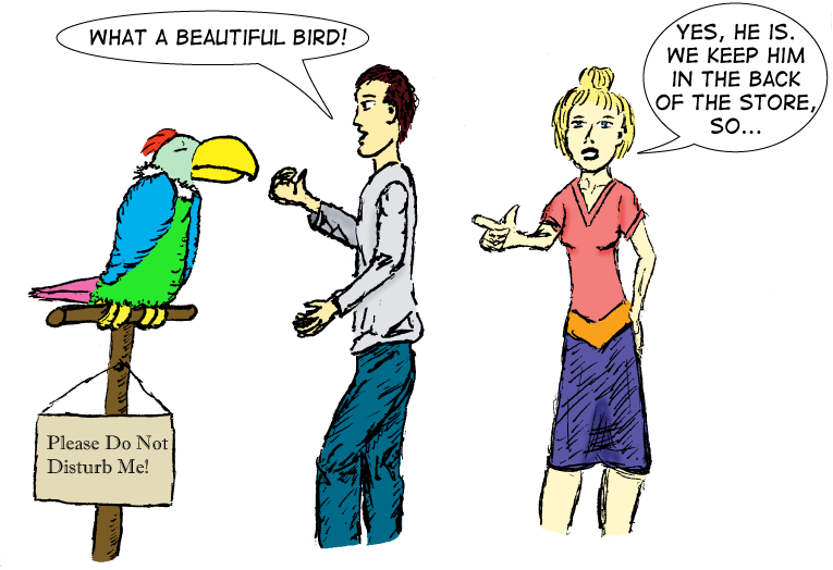
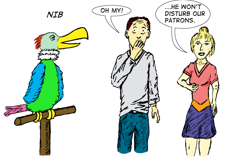
The color scheme for the parrot works decently. Of course the
main sequence is the parrot going from napping to full-on spazzing
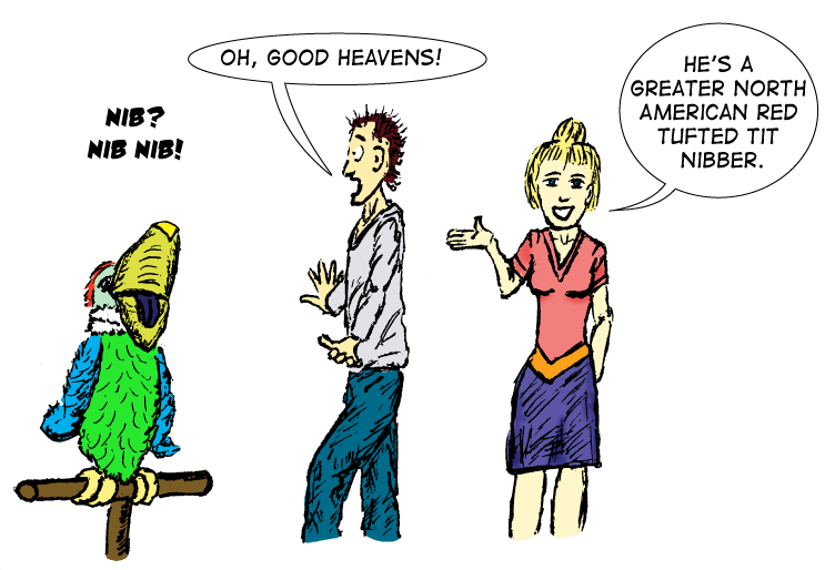
and I'm pretty happy with that. I added the extra feature texture
in frames 3 and 4 right before I inked it. It makes frame 2 look a
little plain and flat (and I didn't use shadowing there), but those
attributes seem to work as the parrot is becoming more animated.
I intentionally didn't draw his tail in frame 3, as it would be
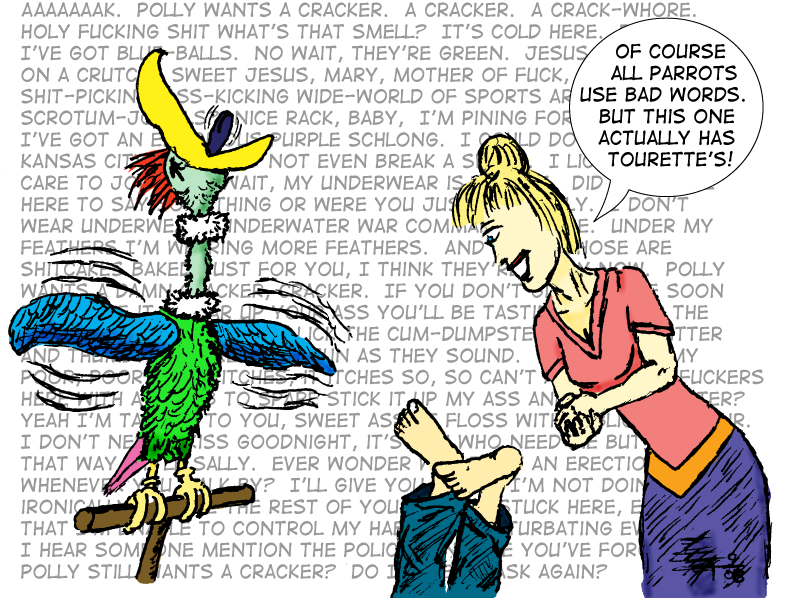
directly behind him. In frame 4, however, I simply forgot to draw
the tail. So I cheated and used the same one from frame 1, rotated
45 degrees. The white tuft is more cartoon-buzzard-like, but I like
the look. I had totally forgotten about the mittens on the hands
on the wings so it's not that Dr. Seuss-ish. The last frame probably
is unintentionally stolen from all those Flintstone episodes that
involve a bird doing something, like being the steam whistle at the
factory.
The Guy
The guy was intended to be as plain as possible: blue jeans and
a gray shirt. Whether he is "disturbing" the bird or not doesn't
really matter...and it's hard to say what counts as disturbing it.
It's like the bird is testing the waters in the second and third frames
which is enough to shock and traumatizae the poor guy. He's as offended
by the word "nib" as I can imagine that I would be if I was like
that and offended by such words. Yes, I realize it's not
actually an offensive term. It doesn't matter, it is a
funny word. And of course by the last
frame, the rant quite literally has knocked his socks off (and his
shoes for good measure). The original sketch had a "Peanuts-like"
angry, circular kind of smoke clouds coming from the bottom of the
panel to show he had fainted, but I liked the notion of seeing him
upside down with his feet poking up from the bottom of the panel.
The Woman
The woman, presumably someone who works at this pet store, is
completely unfazed by this whole thing. Not only does the bird's
rant not bother her, but she continues the sales pitch at the poor,
shocked guy. I wanted her to have some color in her clothes, but
not be a mirror of the bird. The splash of orange helps with that.
One concern I had was that she should look similar from fram to
frame, something I have problems achieving. The hairstyle and color
of the clothes are good cheats for that. I played a little with the
'burn' tool to cast some shadow-highlights on her, more than him.
The bird gets the best ones at the end.
The Bird
I wasn't sure whether to call it a 'tit-nibber' 'tit-nibbler' or
'tit-nippler' but the last two are a bit too blatant. The whole
point is in the vague-sense of the dirty word, paired with the
bird having the name 'tit' in it. In the last panel, I don't have
an ear visible on her, so the eye kind of looks wrong, in a picasso-bad
sort of way. Oh well.
The Rant
And finally, there's the bird's rant. I adjusted it so it's gray
so it won't overpower the foreground images. I wanted to make the
text as weird, non-sequitur, and strange as reasonable, making it
offensive, but just offensive enough. I just typed some long strings
of rants and didn't really plan what is visible and what is obscurred.
Just enough to hint at some things, with some being explicit and others
being obscurred. For the curious, completists (and not easily offended),
here's a link to an image with just the words of the complete
rant, just
don't be too offended.
September 30, 2008
This page last modified Jun 28, 2009.
Home

feed

