
Click here for full size picture.
A Few Thoughts Expressed in Too Many Words
This was the opposite of a quick drawing even though it was such a simple/dumb idea. The thing that complicated stuff was that I wanted to try out a version of Krita that was less than 10 years old. I was intrigued to learn that it allowed both vector and raster images, which could save me from having to jump between Photoshop and Illustrator. And Photoshop's been weird about allowing pressure sensitivity with my Wacom tablet in a VM even though it works fine in Illustrator. Krita deals with my tablet on Linux without any problems. Krita also has some different ways to do shading and I wanted to see how that worked. Turns out it's OK but is a little pokey, though it maybe if I limited the areas I was working on that might help.
The Actual Quick Sketch plus a Reference Image

Pencil sketch of first idea
(click for full size version).
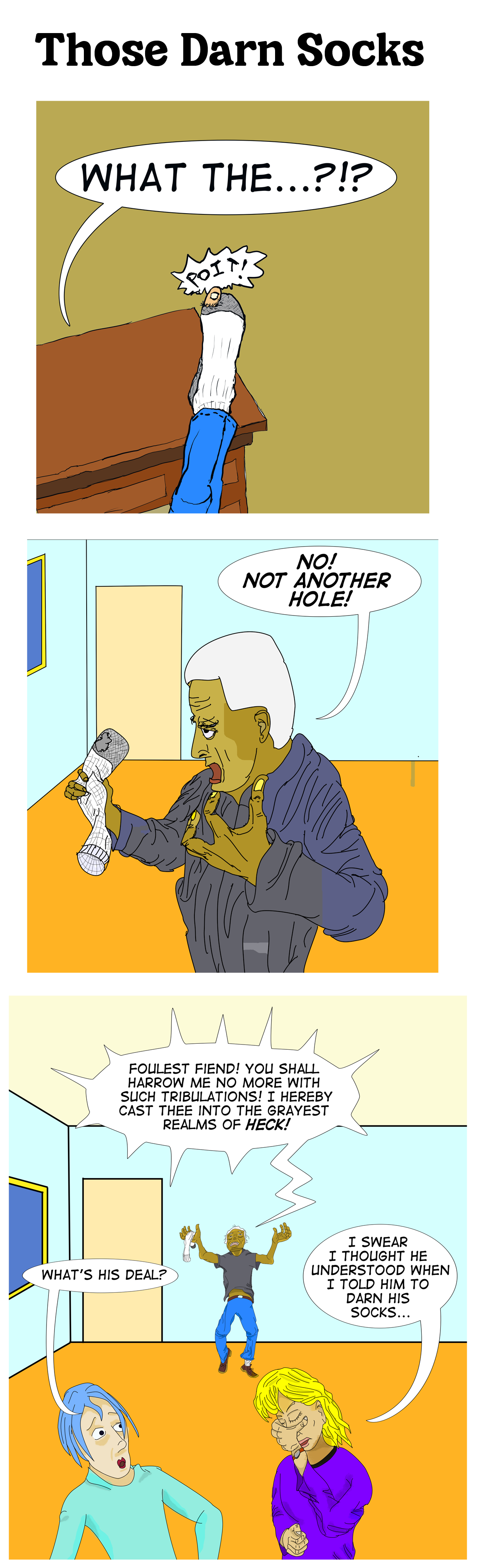
The idea was just a sort of punch line of "darning socks" though the actual non-potty-mouth cursing was added at the end. And actually, I was annoyed when my toe poked out from a relatively new sock (I guess they don't make them like they used to). The original idea was a single panel drawing.
I drew a quick sketch using my little posable wooden figure to try to get a sense of how someone would give quite the finger wagging to their sock.
But I wanted to have to figures at the bottom saying something that was either the punch line or made sense of the crazy rant or both. They'd have to be at the bottoms so the crazy rant would be read first. But the problem then became clear: if they're at the bottom, then they'd be closer to the reader and to have anything approaching a proper sense of perspective (which, personally, I often lack), they'd have to be bigger than the main character rather than smaller. It would be distracting and confusing otherwise. I couldn't think of any way that layout would work.

The reference image of someone (me) raging
at a sock with an actual hole in it that motivated this cartoon
(click for full size version—but why bother?).
So I decided to go with multiple frames.
The first frame would focus in on the toe. I wanted to give some context, so I figured having it propped up on a desk that resembled the desk that was in front of me would be pretty easy.
The second frame would be further back to give a little context, and can show that he's actually raging at the sock. I wasn't exactly sure how that would look. I needed a reference image. So I created one one.
I used it as a reference, I did not trace it, and that charcter, while sharing a sock-problem that I had, was not intended to look like me, nor did I actually act like him.
And then, that would let me put the other two people in the foreground observing the situation in the third frame. It would also mean that the third frame was the only one in which I needed to draw a complete body. Engineered laziness!
The Process
The short version is I used Krita, drew the line art, then added some speech balloons and text, then slowly and painfully colored it, and then did some shading. During that time I read articles and watched videos on how to use Krita. I also upgraded from version 4 to version 5 when I realized the things the videos were talking about weren't in my version and that version 5 has been out for many years.
I also wound up taking a trip to a conference in Europe to give a
talk (nothing to do with this) and was gone for 1.5 weeks, but that
led to a gap of about 1.5 months. When I restarted, I figured
"it's good enough, let's move on." So then I did some cropping
of the frames, put it all together, added a title and uploaded it.
And then wrote this…

Line drawing of frame 3
(click for full size version)
The first step was the line drawings in Krita. This was using Krita 4
which was what was installed when I used apt install krita.
That part was pretty easy. Photoshop was originally designed as an image editing program. Krita was designed as a drawing program. They probably have comparable capabilities, but the flow is a little different. Also, Krita supports vector and raster layers. Photoshop does too, but it's different. What was nice was that it all worked with my Wacom tablet without having to fiddle with things to get it to work. With Photoshop in Windows in a VM, everything is a bit more complicated. So the lines on the sock in the first and second frames were easy to do using a thin brush. However, editing them was more of a pain and it took time to adjust little things, so I didn't do a lot of them, and the figures look weird, but not intentionally so.
The background was very simple and was just some vector lines. The lines cutting off the arms and torsos in the picture were there so the flood fill that I was going to use would have a place to stop. I had already planned to crop the image above those cut points.
The balloons were vectors, and they had a bezier curve editor sort of like Photoshop or Illustrator, but it was a bit different and not as intuitive. It wasn't that hard to get speech balloons with tails that come to a point, but it was new things I had to learn. The spiky shouting in the last frame wound up being way more tedious to do in Krita. The text was easy.
Then there was the coloring. And that was a pain. Krita has some nice capabilities, but it can't compete with Illustrator's Live Paint. There might be better ways than how I was using Colorize Masks, but things were clunky. And Krita's Palette didn't seem as good as the ones Photoshop and Illustrator have. I think I played with a few things and did not save the reference colors on a separate layer at first. Amateur mistake, but that's appropriate. When I had Krita re-render the colors, it could take 10-20 seconds That was tedious. Even the desk took a lot of trial and error to figure out what lines had gaps in them and where the bleed-through occurred when I did the rendering (filling). With Live Paint, the highlighting of the objects makes it clear what has gaps and fixing them is super fast.
After the coloring, I wanted to do some shading. That's where
things got trickier. The menu items the instruction pages showed
were not in my version. That's when I realized that mine was
way old. So I uninstalled the version I was using and
used a different mechanism to get a newer one,
snap install krita and now I had the newer version
and could follow the directions. I also learned that the image
formats were incompatible, but Krita 5 could read in and convert
Krita 4 documents, so that was good enough for me.
But it was still tedious and slow, despite the time-lapsed YouTube videos some artists doing shading in a few minutes (compressed time). I got some of the basics done and then ran out of time.
Finally, after the gap, when I decided it was good enough, I exported the 3 frames as PNG files and pulled them into Photoshop so I could quickly crop them and then combine them into one large image. I added the title, using the Cheria font I saw on a font site and liked how it looked for the title.` I decided to use Photoshop for that because I know how to do those image manipulations quickly in Photoshop and wasn't really sure how to do it in Krita and didn't want to take more time trying to learn that right now.
And finally, I wrote this up, including scanning in my initial sketch and exporting one line drawing.
Oh, and I totally stole the sound effect in the first frame from Mad Magazine's Don Martin.
The Results
I started this in late February 2025, worked on it for a bit until
around March 29. On May 18, I saved the 3 panels, cropped them,
found a title font I liked (Cheria), and declared it good enough.
So that's pretty slow for something this simple. But I learned
about Krita. I like the drawing part. I need to learn a few more
tricks on it to speed things up before I can decide whether I
want to use this again for more of my drawings or just stick
with old Adobe products on an old VM. I'd like to be able to
draw something that looks a little nicer without having to spend
tons of time on it. So I'll probably try another project with it.
Started and completed on Tuesday December 29, 2021.
Back to Frank's
cartoon page.