|
|
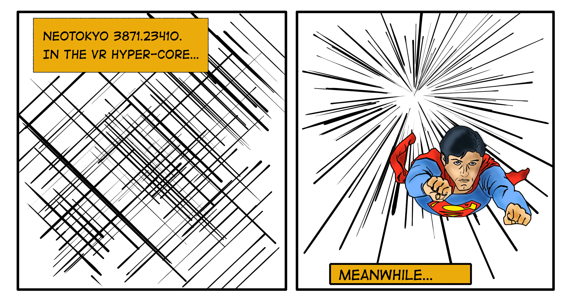
| Meanwhile, Beyond the Vanishing Point... |
![["No need to worry. With my Super Flying Power, I can escape from this nova. And yes, it's different than my normal flying power, which is also super."]](images/Drawings/Sketches/krita-test-sm.png "[\"No need to worry. With my Super Flying Power, I can escape from this nova. And yes, it's different than my normal flying power, which is also super.\"]")
|
|
April 08, 2019
So this drawing has little meaning. The first panel is
nothing but a silly caption and the lines. The second is the vanishing
point and then an OK Superman (more movie than comic book looking) flying
away from some exploding vanishing point. The "Meanwhile..." was just me
testing out how hard it is to deal with text and how hard it is to install
a font (like Blambot's Digitstrip) on Linux (that part was easy). The full
size image is here.
I bought a pen/stylus for my laptop. I can get Linux to recognize it, but
haven't figured out how to get it to work with Windows in a VM yet.
Unfortunately, that means I can't use the pen with Photoshop or
Illustrator. However, the GIMP and Krita do recognize it. I had tried
using Kritia a few years ago and it did not work well. I've used the GIMP
before and it's fine for simple things, but it's no Photoshop and provides
none of Illustrator's capabilities. I decided to try Krita again to see
what's changed.
First, it does work. I wanted to play with some of the
"assisstants", like the rulers and perspective tools. The perspective tool
looks pretty cool, but first I tried the parallel ruler which allows the
user to draw lots of paralle lines. I did a bunch and thought it looked
cool, like some sort of Matrix-y kind of thing. Then I tried the vanishing
point tool, which allows the user to draw lines that always point to the
(if there's only one) vanishing point. Pretty simple, but useful.
But looking at the uber-aterisk pattern, it reminded me of a comic book I
read long, long ago that starts with Superman flying through outer space
and a star goes nova behind him. Doesn't really bother him that much, but
it was a cool visual. I wanted to reproduce that, so I draw a horrible
sketch, then decided to find a reference image. Couldn't find many comic
book ones of him flying head-on. There were tons of hits from the
Christopher Reeve movie, but it was essentially all the same image where
one arm is out, the other is by his chest. That's not what I
wanted—I wanted him, arms in front of his head, hands in fists,
heading right towards the viewer. Eventually I found one.
I used that as a reference image and
did a sketch of it. Then I learned that Krita supports both raster and
vector graphics, which is quite cool. So I could ink it in the same
program. Coloring was a little more clunky as it doesn't have the "live
paint" capability of Illustrator. Shading was even worse. First, there
are very few online tutorials or discussions on it (compared to Illustrator
or Photoshop) and it does not provide an easy way to make slices and do
fill shading, again lsomething that Live Paint provides. Painting with a
brush means that it's hard to blend things, as different strokes will make
secutions have variations in shading. Using a blur filter on a filter
layer helps smooth things out, but it seems like it's not as easy and
still looks blotchy. Of course my skills are limited, as is my knowlege
of tall of the capabilities of the program. So the jury is still out.
I'm not sure if I'd swtich over to it. But for some things it is appealing.
And for travel, taking the new pen/stylus is easier than taking my
Wacom tablet, plus the pen (and the holder for good measure).
So we'll see if I use it more or not
|
Other entries
| < |
April 2019 |
> |
|---|
| Sun | Mon | Tue |
Wed | Thu | Fri | Sat |
|---|
|
1 |
2 |
3 |
4 |
5 |
6 |
| 7 |
8 |
9 |
10 |
11 |
12 |
13 |
| 14 |
15 |
16 |
17 |
18 |
19 |
20 |
| 21 |
22 |
23 |
24 |
25 |
26 |
27 |
| 28 |
29 |
30 |
|
|
|